How The World Map You See Is Dead Wrong

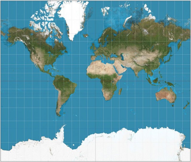
This is the world map we usually see. What I want to tell you today is that this is map is actually wrong, or at least misleading.
It is drawn with the Mercator Projection method invented in the fifteenth century. The size and shape of the countries on the map is drastically distorted in some areas on the map.
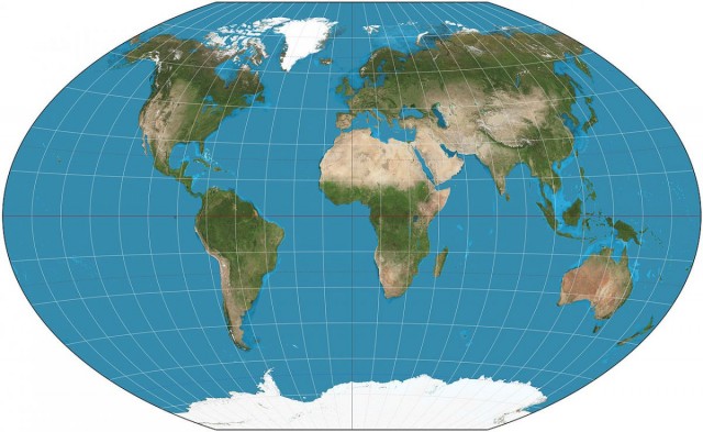
The reason for the distortion is a bit complex, but I will make it simple with an analogy. Our Earth is roughly spherical. If you skin the surface of the Earth and lay the skin flat as you do with an orange, you will realize that the flat skin is not rectangular, but close to something like the following with the Winkel Tripel Projection.
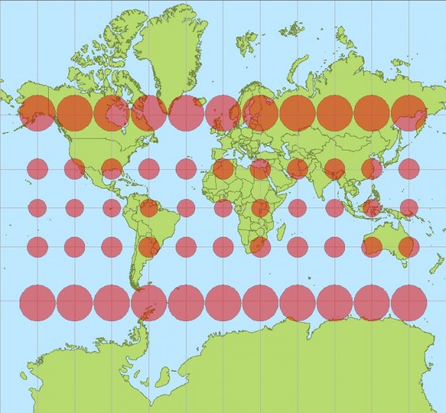
To force the skin to be a rectangle, Mercator Projection is used to make the length of the circles of latitude the same. Here is an illustration of the distortion with the Tissort’s Indicatrix. The Circles in this map is the same size if there is no Mercator Projection distortion.
Here are a few major misconceptions based on this Mercator Projection map:
- Alaska is nearly as large as the continental U.S.
- Greenland is roughly the same size as Africa.
- Europe (excluding Russia) is only a bit larger than South America.
- Antarctica dwarfs all the continents.
In reality:
- Alaska can fit inside the continental U.S. about three times.
- Greenland can fit inside Africa about 14 times.
- South America nearly doubles Europe’s land mass.
- Antarctica looks like the second-smallest continent.
Here is an animation to show you more straightforward change due to Mercator Projection.